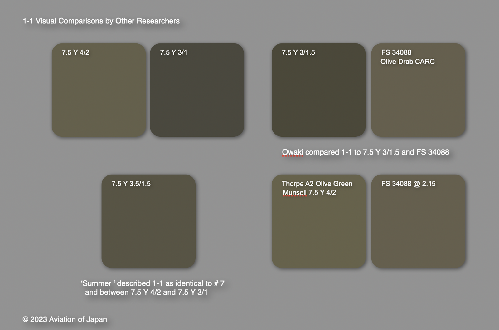
JAAF paint colour # 7 Ohryoku Nana go Shoku (Yellow-green no.7 colour) was directly superseded by paint colour 1-1 in the 8609 standard. Prior to this and in the late summer of 1944 the # 7 paint colour had been designated as the standard colour for all Army aircraft, inside and out, to be applied at factories which had been ordered to resume painting before delivery. Note that some aircraft, like Hien and Hayate, were in continuous production runs before and after this order, which affected the schemes they appeared in, a fact still not understood by some kit and decal manufacturers, as well as some modellers, who sometimes mix up the before and after component colours or cite non-standard designations for them, such as 'olive green'. Army Depots began applying the # 7 paint colour to aircraft received in natural metal finish some time before the factories got underway with painting which resulted in variations.

In publishing the measured L*a*b* values of the 8609 1-1 swatch the Japanese Aeronautic Association Aviation Heritage Archive (JAA) state that 'as indicated by the a* value no green tint'. The a* value representing red-green chromacity, runs from negative for green to positive for red and in this case is 0.06, so barely red from green. This makes the 'yellow-green' description puzzling, but it is a low saturated yellow-green in the same family of colour as WW2 British Army khaki drab battledress (re-runs of 'Dad's Army' on TV will assist in clarifying this perception!). The b* value, representing negative blue to positive yellow is 6.41. The published facsimile swatch does have an apparent faint green undertone and appears exactly similar to US Dark Olive Drab. Rendered in sRGB the green undertone is not so apparent. FS 34086 is deemed 'close but distinguishable' and was the same FS value compared to 1-1 back in 1975. But curiously it was also then compared to Munsell 2.5 GY 3/2 where the green is more apparent. The Munsell colour has a negative a* value of -4.378 which explains it, but the apparently inconsistent comparison might be rooted in subjective green vs brown perceptions, always difficult with low saturated olive drabs/browns.

Observer metamerism or observer metameric failure occurs because of differences in colour vision between observers. The common source of observer metameric failure is colour blindness, but it is also prevalent among ‘normal’ observers, especially when it comes to subjective colour matching. In all cases, the proportion of long-wavelength-sensitive cones to medium-wavelength-sensitive cones in the retina, the profile of light sensitivity in each type of cone, and the amount of yellowing in the lens and macular pigment of the eye, differs from one person to the next. This alters the relative importance of different wavelengths in a spectral power distribution to each observer's colour perception. The inconsistency in comparing 1-1 by. presumably, a single observer, is harder to explain!
The # 7 swatch (above) that the late Bill Leyh created is slightly lighter in the red and green of sRGB than the measured 1-1 swatch, but the latter has probably darkened and 'browned' slightly with age.
JAA also note the similarity of 8609 paint colour 2-2 to 1-1. The new colour 2-2 directly superseded Army paint colour # 43 but was categorised as a 'Gray' despite the earlier colour being designated 'Earth'. A low saturation grayish brown with exactly the same a* value as 1-1. This dark colour, described contemporaneously as 'yokan iro' (a kind of dark brown sweet), has been associated with overall schemes on the Ki-45, the Ki-102 and has been identified on a Ki-100 artefact. It was evidently important enough to transition from the earlier standard to 8609 and has been associated with night fighters, but official purpose remains obscure.
Post-blog note: This article is about the JAAF paint colour standards # 7 and 1-1 and the perceived matches to those colours by various researchers. It is not about the applied paints supposed to be matched to that standard which will be addressed in a future blog article. Nor is it about the vagaries or appearances of US Olive Drab, which have been argued about on modelling forums ad nauseum.
Image credit: All, © 2024 Aviation of Japan.


16 comments:
As usual a very interesting analysis regarding the colours used in the last period by the IJAAF, thanks Nick.
More brilliant research my friend. I've gone back to your first post and have read everything color related you have posted, and I also have all of your PDF files. I must say, this begs for a good book like the many examples of Luftwaffe and allied colors. History, color standards, paint swatches and color profiles........please:)!
I think it's very important to know what was the real color and the real standart, especially for modellers. Great thanks for the investigation, Nick.
Thank you 'bop' and Alex for your kind appreciation of the blog article and taking the time to express it. Much appreciated.
Regards
Nick
Thank you Scott. I'm working on it - very slowly!
Regards
Nick
Thanks for this discussion of the #7, 2-2, 1-1 & #43 colors, Nick. Most appreciated.
Good to see Aviation of Japan up and running again. It looks like there were a few changes by Google (?)
Thanks for this update on # 7 Ohryoku Nana go Shoku! This colour certainly deserves more of your research Nick - it's such a controversial paint scheme.
Thanks Nick, as always, excellent research my friend.
A pleasure, you are back!!
Excellent article, Nick. Never heard before about 8609. I'm happy AoJ is back, it inspired me to return to my old passion, after 24 year hiatus.
I meant 14 years, sorry for the typo.
Fascinating and invaluable!!!
Kudos to Nick for his extensive research which we all benefit from
Three Cheers for the return of the one and only "Aviation of Japan"!!!
Wonderful post, Nick. Really appreciate your sharing this with all of us!
I will join the rising chorus calling for a series of books by Straggler on IJAAF & IJNAF colors. They would be most welcome.
Post a Comment